In 2021, the College Board® added a new section to the AP® U.S Government and Politics Exam: quantitative analysis. This counts for four raw points on the exam. Along with the data project, students are asked to evaluate data and use their critical thinking skills to connect data to political phenomena. The data is not viewed in isolation, rather it is helpful to evaluate student understandings of larger patterns, trends, and themes in American politics.
Students are presented with quantitative data in the form of a table, graph, chart, map, or infographic. Typically, students are asked to do the following in the four-point question:
- Describe the data presented. Usually this can be accomplished by simply reading the data.
- Describe a pattern or trend in the data.
- Describe a similarity or difference in the data.
- Draw a conclusion based on the data.
- Connect the data to a linkage institution in American politics.
- Explain how the data can be used to draw a conclusion about a political institution, a political process, a political policy, or a behavior.
To better help students understand how to complete the quantitative analysis and to provide strategies for thinking about the components of each question, let’s walk through this question from the 2021 AP Gov Exam.
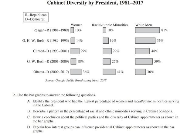
Part A: The first question merely asks students to identify the President who had the highest percentage of women and racial/ethnic minorities serving in the Cabinet. Students should look closely at each of the three groups in the bar graph and quickly identify the women and racial/ethnic minorities category and find the corresponding President. The correct answer is President Obama. Students should write a full sentence stating that President Barack Obama had the highest percentage of women and racial/ethnic minorities in his Cabinet.
Part B: The second question asks students to identify a pattern in the appointment of women and racial/ethnic minorities to the Cabinet. This type of question allows students a little flexibility. Students could choose to focus on political parties by correctly identifying what the D or R stand for, or they could look at the general trend over time. Students could correctly state that the percentage of women and racial/ethnic minorities, regardless of President, increases in Cabinet positions over time, or that Democratic Presidents have appointed more racial/ethnic minorities. One key point here for students: use full sentences to describe the trend. It is not enough to say, “It went up.” What went up? Ask students to be clear and identify what changed or the pattern they observed.
Part C: This is answering the “Why?” question. Why did the patterns you observed occur? It is important to note that B and C are graded separately. The pattern observed in Part B is not graded in tandem with Part C. For example, students could write about Democratic Presidents increasingly appointing women and racial/ethnic minorities to their Cabinet in Part B, but focus their response in Part C on the Republican President increase in women and ethnic minorities in the Cabinet over time. Acceptable responses for this component include that the Democratic Party wants the Cabinet to look like the demographics of their party, or Republican increases can best be explained as an attempt to appeal to a wider group of voters.
Part D. Generally, this type of question asks students to connect the data to a broader political phenomenon and apply this knowledge to a new setting. In this case, the question wants to assess student understanding of how interest groups can impact the political process and the tools of lobbyists. In answering this question, the graphic is not much help and students will have to draw upon their background knowledge of American politics. For this question, it would be helpful to know that the Senate is responsible for confirmation of Cabinet appointments. In that case, students could correctly identify that interest groups can run media campaigns or use lobbying to pressure Senators to confirm or reject a Cabinet appointment. Alternatively, students can also correctly identify how interest groups can use media campaigns to pressure Presidents to make appointments that reflect the interests of the group.
Remember that some students may go further and name examples of these phenomena. For example, “the NAACP applied a media campaign to pressure President Obama to appoint a Black Attorney General as they did in the case of AG Eric Holder.” While this adds clarity to the point, it is not necessary.
Pat Sprinkle is a 13th year history teacher at the NYC Lab School for Collaborative Studies, teaching AP® U.S. History and AP U.S. Government and Politics. Pat is a graduate of The Ohio State University and Columbia University. Pat has served as a member of the Teacher Advisory Council for the Bill and Melinda Gates Foundation, National Humanities Center, and the National Constitution Center. In addition, Pat was a 2013 James Madison Fellow along with a 2021 C-SPAN Fellow. Pat lives in Jersey City, New Jersey, with his wife, son (Franklin), and dog (Lyndon).